
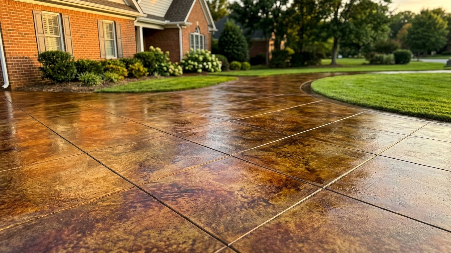
What a stamped pattern actually does: texture, not a picture
Understanding this makes the choice much easier and prevents the most common disappointment.
A stamp presses a texture into concrete while it is still green, so what you get is genuine relief in the surface rather than an image printed on it. That is why stamped work reads convincingly from a normal viewing distance and why it wears like concrete rather than like a coating.
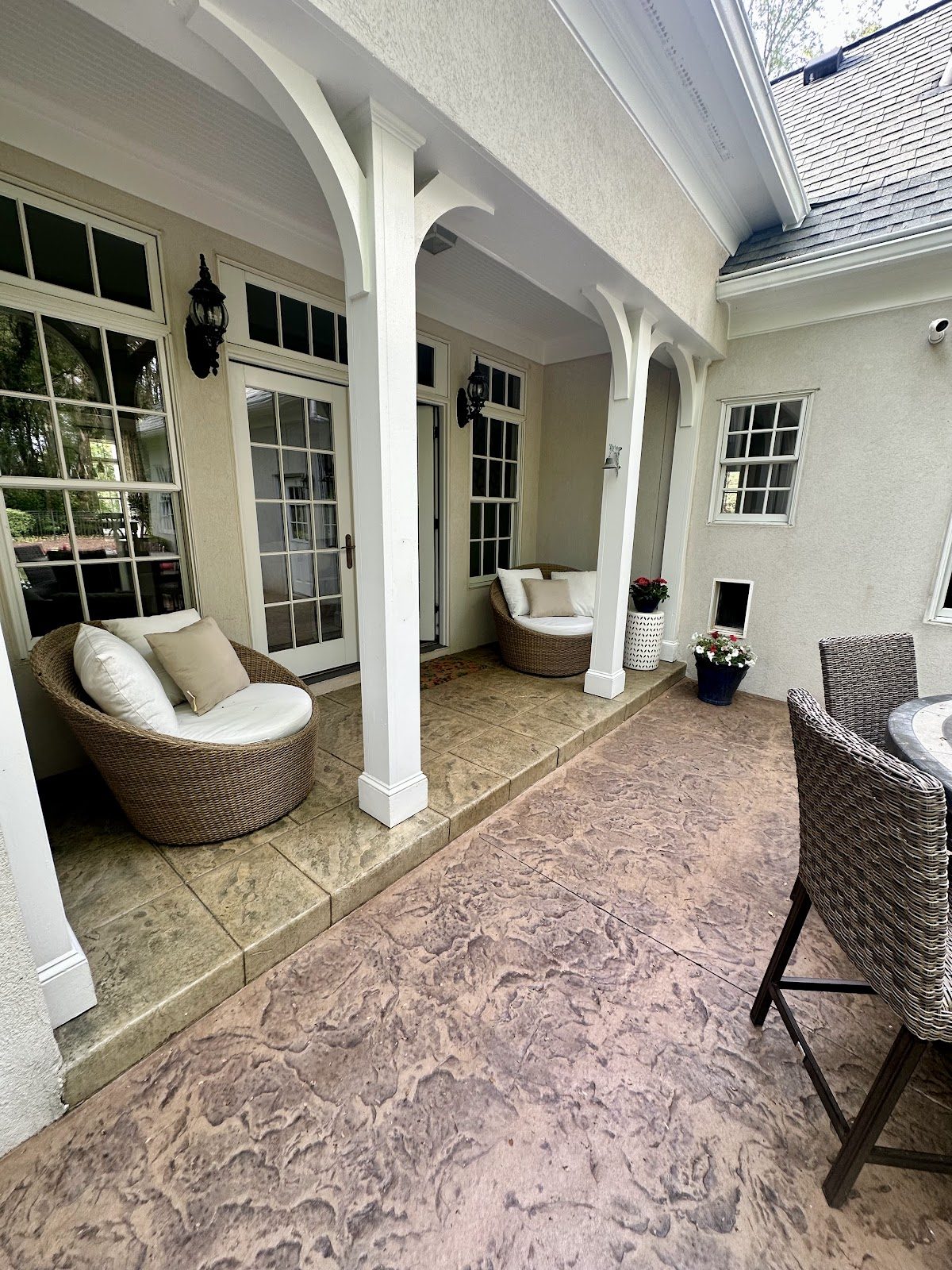
It also sets the limits. Stamped concrete imitates stone extremely well, because stone is irregular and so is a good stamp. It imitates modular paving less convincingly, because what makes a paver field read as pavers is real joints and real shadow between separate units. If a paver look is genuinely what you want, our comparison guide is honest about that.
Stamped concrete pattern families and what each commits you to
These are the families rather than a catalog; within each there are many stamps.
| Family | Reads as | Consider |
|---|---|---|
| Slate / textured stone | Natural stone, irregular, understated | The most forgiving choice; suits most houses; good grip |
| Ashlar / cut stone | Formal cut-stone paving, regular joints | Reads more formal; layout and joint alignment matter more |
| Cobble / brick | Older, smaller-module, more textured | Busier at large scale; often best as a border or a small area |
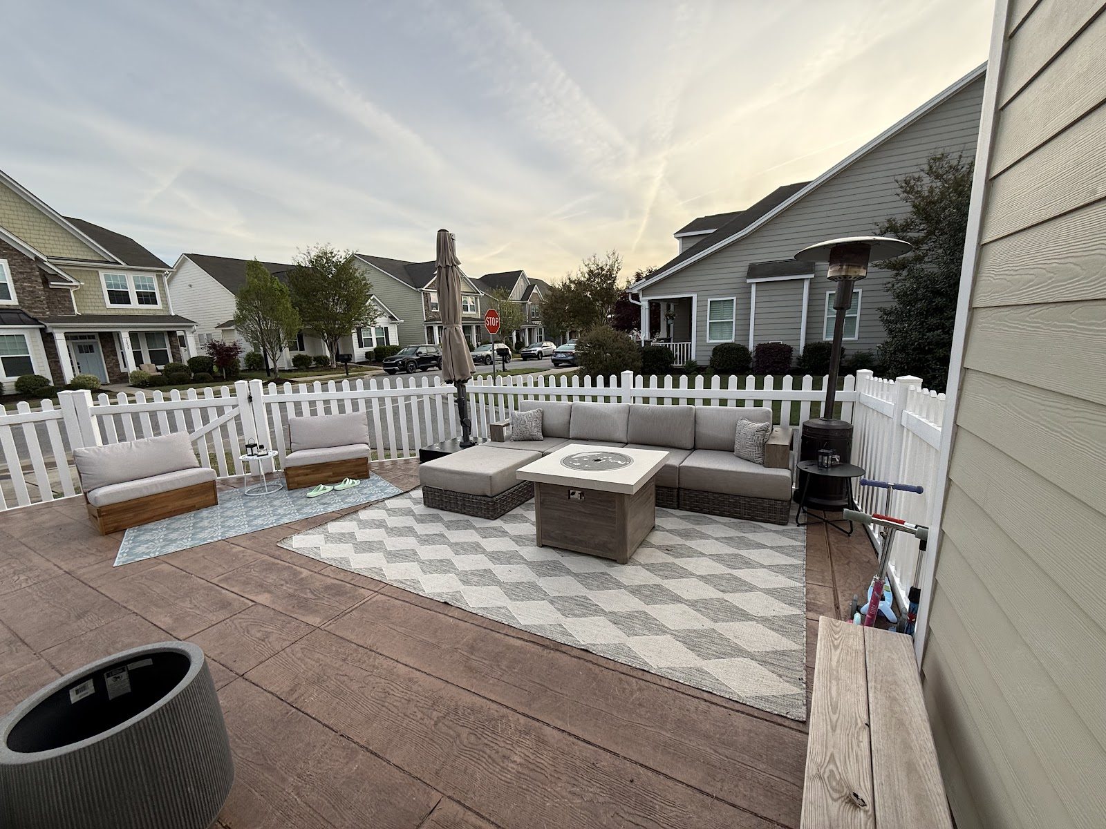
| Wood plank | Timber decking | A distinct look that either suits the house strongly or does not at all |
Choosing stamped concrete color, and the mistake to avoid
Color is where stamped work is made or ruined, and the choice is less free than the sample board suggests.
Integral color goes through the mix. It is the more durable of the two, because wear does not expose uncolored gray underneath. Release and surface color is worked into the top during stamping and is what gives depth and variegation. Most stamped work uses both.
The mistake is choosing the color against the sample board rather than against the house. A stamped surface is a large, continuous area that sits next to your brick or siding or stone permanently. A color that is beautiful in isolation and slightly wrong beside the house is a twenty-year irritation, and it is not adjustable afterwards without resurfacing.
The practical technique is to look at samples outdoors, in daylight, held up against the actual house — not indoors under artificial light. And to ask for a photograph of a finished installation in the same product rather than a sample chip, because a large area reads differently from a small one.
What the choice commits you to: grip, upkeep and how it ages
Three consequences that outlast the decision.
- Grip. Deeper textures grip better wet and are less comfortable barefoot. That trade-off is worth resolving deliberately by surface: a pool deck and a front entrance want different answers. See pool decks.
- Upkeep. Decorative concrete wants resealing to protect color and pattern, which plain concrete largely does without. That is a running cost rather than a problem, but it should be in the decision. Our stamped cost guide covers the published figures.
- How it ages here. Red clay stains and shallow freeze–thaw cycling works on the surface, which is an argument for variegated color and for sealing rather than against decorative work — a patterned, multi-tone surface disguises staining far better than plain gray does.
What we build is on the stamped concrete page, and what we do locally on the Mooresville page.
Two things to do before you commit to a pattern and color
The decision is made from small samples and lived with at large scale.
See it big. Ask for a photograph of a completed installation in the same pattern and color rather than judging from a sample chip. Pattern scale reads completely differently across a whole patio than across six inches, and a busy pattern that looks rich on a sample can look restless across a driveway.
See it outdoors, against the house. Daylight and the actual brick, stone or siding are the only meaningful test. A color chosen under indoor light beside nothing in particular is a color chosen against the wrong reference.
Pattern and color questions.
Chosen once, lived with for a long time.